
- Design strategy
- Content strategy
Scope of work
- Full-scale web app
- Wireframing
- Interaction design
Pulse is company-wide tool for measuring the experience people have at Facebook
Twice a year, everyone at Facebook is surveyed about things like:
- How satisfied are you?
- Are you proud to work at Facebook?
- Is your work fulfilling?
This is done so that management can understand where they're doing well, where they need to improve, and what actions they need to take to keep Facebook an awesome place to work.

Manager Summary
The Problem
- Managers need improved ways to view and compare cuts of data across a variety of dimensions while keeping those who participated in the survey anonymous.
- Bad user flows, and page layouts are resulting in a bad user experience .
- It is difficult for users to discover and synthesize desired content.
Original Manager Summary
Original Analyze My Data
Users Need Improved Ways to View and Compare Data
The first version of Pulse was widely hailed as a success so naturally our team was called upon to make incremental improvements to the product. Requirements, informed by user feedback, Version 1 was built in Tableau, was slow and had its limitations.
Process & Design Thinking
Frequent meeting with stakeholders netted our initial set of requirements.
A system-level approach yielded a thoughtful analysis of Qordoba's current product offering, helping lay the groundwork for new product architecture. Users need a simple and useful way to navigate to desired projects, access new content and collaborate with other users across the platform.
Identifying the Users
Orienting the following users throughout the system: The content creator (linguist), engineer, project manager, and project owner.

Original USER FLOW

Documented Pain Points
logged through unmoderated user testing
- Once a project is selected users goes directly to content root page
- No visibility into the project. Users must return to the project page repeatedly until they have selected the correct project.
- Projects in which user does not have permission to view are selectable but lead to a dead end.
- The content Feed is rendered useless because users land on content page first. This makes discovery and collaboration almost impossible.
- A great deal of effort is placed in searching for new or relevant content. Useful content is often overlooked.
Updated User flow

The Visual Implementation
I set out to design a product that felt reliable yet welcoming. A new icon set was also created in order to establish the desired voice and tone of Qordoba's new application

Design Exploration & Ideation
Break down designs into components and outcomes to validate interaction for stakeholders and clearly document them for use by dev team
Preliminary design Exploration


The layout becomes less useful when we introduce real use cases
Content translators often have limited permissions. They will not likely have access to all available project, organization. Additionally they will not have permission to create new projects. This is also what a page may look like when new projects are introduced.
The inconsistency in the way that data is being presented also creates more issues.
New Project Dashboard
Create project, collaborate, and navigate to desired pages
Structuring the Data
For improved scalability
[User] has [an Action] in [this location]

Content type inventory organized by category

Structural Hierarchy through Card Density
For improved learnability

Modular Content Cards

User Stories
Orient the user throughout the system and help them achieve targeted outcomes

Working wireframe

Visual Heirarchy
For enhanced scanability

Establishing look and feel starting with Delightful Icons
Qordoba's icons were designed to be light, airy, flat & functional


Design Pattern Library
Components are are based on established patterns to create familiarity
Complete library not shown
Results Summary
The Results Summary dashboard enables managers to analyze their current team’s Pulse results and provides tools to compare those results against prior periods or various benchmark groups.

Preset filters allow user to set up most common comparisons. A curated set of advanced filters are also available for deeper insights.


Analyze My Data
Analyze my data gives managers the capability to compare Pulse Results for groups within their hierarchy. The default view for this tab will show the results for the rollup of every manager with 4+ respondents who report into you.


Importance
The importance dashboard shows managers the relative importance of questions based on responses from their team. It also identifies Key Drivers for their organization (Tech/GMS/Biz) that statistically predict “intent to stay” or “engagement”.
Clicking on any node within the chart will give users additional information about the results.

Comments
The comments dashboard shows managers all of the responses provided by the people in their rollup to the two open-ended questions that were asked in Pulse. Additionally, the comments are organized by assigned tag; any one comment may have multiple tags.

Final Thoughts
It was challenging to design a solution that satisfied the needs of various user types, content types and use cases. With that said, it easy to fall into the trap of over designing for each use case. I found that it was important to exercise restraint before designing a solution that was a literal execution of Qordoba's requirments.
More Featured Projects
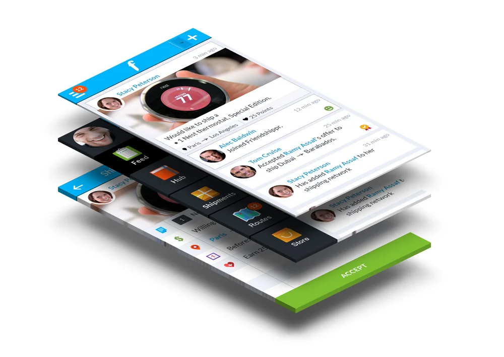

Friendshippr
A mobile only peer to peer shipping app that leverages your social network.
CASE STUDY COMING SOON
Socialplex
A social app that turns events into experiences that last forever.