
UberCARE is a reliable way for for the Elderly to be mobile again.
As people age mobility becomes challanging. Some seniors should not or can not drive. So important tasks like going to the doctor, attending their fitness classes, and getting groceries fall out of reach.

The Problem
Users aged 65 and older are 43% slower at using websites than users aged 21–55. This is an improvement over previous studies, but designs must change to better accommodate aging users.
- Neilson, Usability for Senior Citizens
- Seniors above the above the age of 65 inability to remember actions
- They also have worse dexterity than a user 21-55
- They don't understand some mobile paradigms and complex user flows

Seniors have a simpler lifestyle
UberCare can improve the mobility of Seniors so they can get around and do the things they need to do. UberCARE brings the reliability of Uber but with the added care that Senior require. Extra help, disability accommodating vehicles, and easy to use interface.
Because Seniors have a pretty structured lifestyle it will be easier for Uber to learn the needs of the user over time.
Process & Design Thinking
A system-level approach yielded a thoughtful analysis of Uber current product offering, helping lay the groundwork for new product architecture. Senior users need a simple and useful way to navigate book a car without all the added steps of setting new locations, entering promo codes, and updating profiles.
Identifying the Users
Orienting the following users throughout the system: The content creator (linguist), engineer, project manager, and project owner.
Current USER FLOW
Documented Pain Points
logged through unmoderated user testing
- Buttons are small
- Too many car options
- Fare estimate is not required. Seniors are more price conscious
- Setting destination other than where they currently are seems to be unnecessary for a user who is not very mobile.
- New flow is more like offline activity to enhance adoption and retention
Updated User flow
The Visual Implementation
I set out to design a product that felt reliable yet welcoming. A new icon set was also created in order to establish the desired voice and tone of Qordoba's new application
Design Exploration & Ideation
Break down designs into components and outcomes to validate interaction for stakeholders and clearly document them for use by dev team
Preliminary design Exploration


Larger clickable cards for most recent destinations
Having images of the places that they go to the most not only makes the area easier to select but reduces the cognitive load of the user. If they spot the place they are looking for chances are they won't have to read through too much text.
More Featured Projects
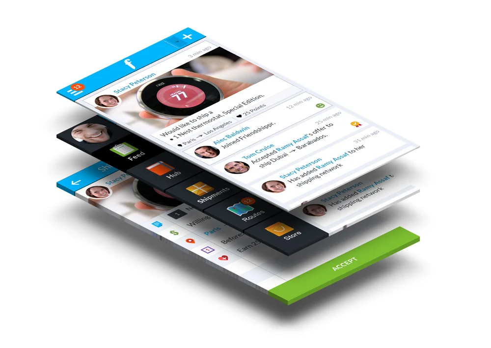

Friendshippr
A mobile only peer to peer shipping app that leverages your social network.
CASE STUDY COMING SOON
Socialplex
A social app that turns events into experiences that last forever.